1. Landing Page for Partners
March 2018
Part of The Laughing Cat Bake Shop's overall growth strategy is to become a supplier of baked goods to local businesses. To help them achieve this goal, I developed a simple and dedicated landing page as part of their WordPress website.
I began by creating a wireframe in Adobe XD to quickly show the main components of the landing page: a hero banner, a column detailing information about the partnership and a form where users can register their interest.

Once the layout was approved, I worked with the client to come up with copy that answers potential questions that interested parties may have. The text block is broken up into sections with headings that clearly identify the benefits of partnering with The Laughing Cat.
I then created a custom template for this page based on their theme to keep everything visually consistent.
The form was created in WordPress using a plugin and linked to MailChimp so they can track leads and monitor its performance.

To promote their new landing page, I also helped them set up ads on Facebook and Instagram.
I made it a point to make sure that the language and imagery used in the ads were similar to the ones seen on the landing page for a seamless user experience.


You can see this page live here: The Laughing Cat Bake Shop Partners
2. Training Registration Landing Page
February 2018
After finalising their training offerings for 2018, Protecht asked me to refresh their landing page with the following goals:
- Make it easier for users to see the course offerings at a glance
- Inform users of new training locations
- Encourage users to make multiple bookings
This landing page uses a newly-created reusable template in Hubspot. Scroll through the slides below for a closer look:


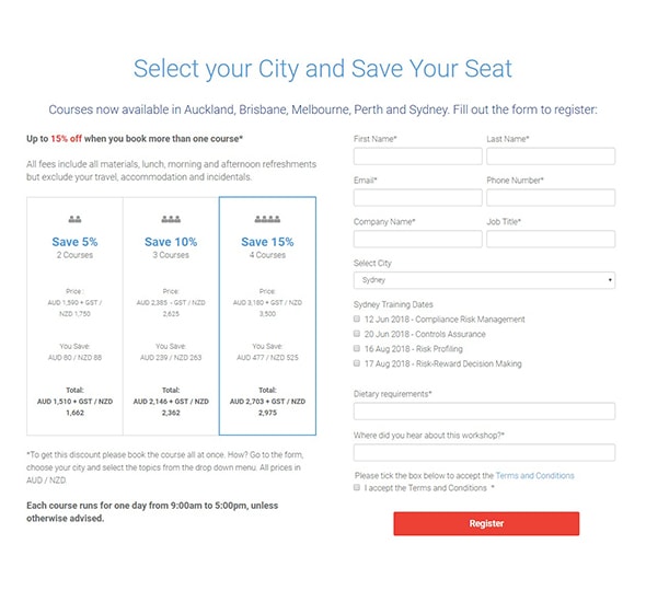

View this landing page on: Protecht's 2018 Risk Training Courses
3. Demo Request Landing Page
November 2017
Late last year, the Protecht Sales and Marketing team kicked off a paid ad campaign aimed at increasing system demo requests from potential customers. To support them, I developed a new page template and created a landing page in Hubspot.
We kept the landing page fairly simple with sections that are focused on delivering one key message each.
Hero banner
The landing page header introduces the user to Protecht's software using a colourful screenshot of the system dashboard and a quick but clear statement of its benefits to the user. A red Call to Action presents returning users with the option to skip ahead to the sign up form at the bottom of the page.
To ensure that users focus on completing the mission (ie requesting a demo), I removed all other navigation from the header but retained the company hotline on the top right.
Software features
Protecht provided the copy used in this page but left it up to me reorganise and rephrase so it fits the narrative better. For example, the original copy presented all bullet points in one big list. To make it easier to skim and digest, however, I grouped the points into solutions that address pain points for the target personas.
Image gallery
Rather than bombard the user with a lot of text, I implemented an interactive image slider which displays a system screenshot and a short description of what they can do with each system module. At this point, interested users can go directly to the form using the Call to Action button.
Social proof
This section lists of some of Protecht's notable clients and aims to help ease any worries or reservations that are keeping the user from requesting a demo.
Call to Action and form
We limited the form to five fields to keep it from appearing daunting and made the submit button wider so it is more prominent in the section.

I'd love to work with you!
Click the button below to send me a quick note about how I can help you with your project: